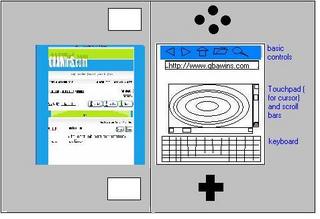
My DS Browser Mockup
Please excuse how horrible this looks; I'll redo it with (PAINT SHOP PRO) when I get a chance. Anyway, I just wanted to jot down quick ideas with paint (since I'm at work) on a sidways browser for the Nintendo DS. I personally think this would be the best orientation, although my layout may not be optimal. Essentially the web page is on the left and the controls on the right. The basic controls could be on top, a touchpad (for cursor movement) with scroll bars (for the web page) in the middle, and the touch keyboard on the bottom.


0 Comments:
Post a Comment
<< Home